
Instagram’s 2026 Rebrand
Instagram’s New Logo Isn’t Really a New Logo–and That’s the Point
If there is one thing the internet can agree on, it’s that everyone has an opinion about a new logo. Instagram gave us the latest example.
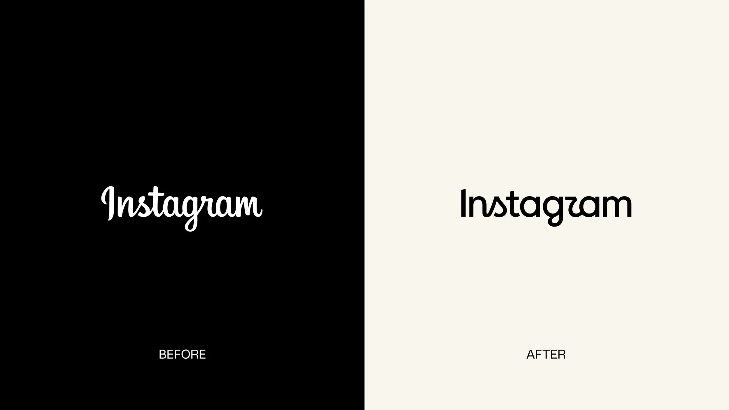
On August 13, 2026, Instagram unveiled its first major brand identity refresh in roughly a decade. But despite the headlines, the familiar gradient camera icon on your phone isn’t going away. The most noticeable change is Instagram’s wordmark (the written “Instagram” logo at the top of the app) along with a broader identity system that includes refreshed typography, motion, layouts, UI treatments, and a more restrained use of the brand’s signature gradient, according to Meta’s Design at Meta team.
Within hours of the new logo’s launch, the internet did what the internet does.
Some people called the new look cleaner and more modern. Others mourned the old script. And one critique quickly became a meme: thanks to the shape of its redesigned “r,” some users think the new wordmark reads less like Instagram and more like “Instagzam.” Fast Company reported on the recurring criticism of legibility alongside more positive reactions to the modernization.
It is much too early to declare Instagram’s rebrand a success or a failure. All we have right now is a launch-day reaction, not a meaningful, evidence-based longitudinal brand assessment. But the conversation and controversy are useful, because Instagram’s evolution offers an unusually public lesson in what organizations should (and shouldn’t) do when reconsidering their own brands.
Instagram has been here before.
This isn’t Instagram’s first encounter with rebrand outrage.
The company launched in 2010 with the detailed, retro camera aesthetic many early users still remember fondly. By 2016, however, Instagram was no longer simply a filtered photo-sharing app. It had grown into a much larger social platform, and the highly detailed camera icon increasingly represented the product Instagram had been rather than the company it was becoming. Fast Company’s history of the Instagram logo traces this evolution.
One of the more revealing stories from Instagram’s 2016 redesign had almost nothing to do with graphic design. Ian Spalter, then Instagram’s design head, asked employees to draw Instagram’s existing logo from memory in just five seconds. The three most remembered things: the rainbow, the camera lens, and the viewfinder. Fast Company documented the exercise in its look back at the brand’s evolution.
These elements represented Instagram’s distinctive brand equity. Instead of starting with a blank canvas, the team used them as raw material for the new identity. This is a deceptively simple exercise with a powerful principle behind it: Before deciding what to change, understand what people already own in their minds.
So Instagram made a dramatic change.
The vintage camera became a simplified camera glyph against the now-familiar pink, purple, orange, and yellow gradient. The reaction was brutal. Contemporary coverage, including GQ’s take on the 2016 redesign, captured just how intensely some users disliked the change.
Ten years later, that supposedly disastrous redesign looks considerably different in hindsight. A Creative Bloq retrospective concluded that the gradient identity had aged remarkably well and become one of the world’s most recognizable app icons. Rather than abandoning it in subsequent years, Instagram reinforced the system, including a 2022 refresh that made the gradient more vibrant while introducing Instagram Sans and a broader modular identity.
This history offers an important warning for anyone judging this week’s redesign: Immediate discomfort is not the same thing as long-term brand failure.
Meta’s account of the 2026 redesign process says the team explored hundreds of directions for the wordmark, including all-caps approaches, camera concepts, and literal handwriting. But when designers moved too far away from script, the brand stopped feeling recognizably Instagram. They ultimately returned to the script because it had become connected to the warmth, individuality, and human expression Instagram wanted to preserve.
But there is another lesson lurking inside “Instagzam.” Even a strategically sound idea can stumble in execution. Instagram deliberately retained script because it communicates personality and human expression. Strategically, that makes sense. But if a meaningful number of viewers misread a letterform, the reaction raises a legitimate usability question. This confusion around the hybrid script-and-print letterforms has become one of the most consistent criticisms of the new mark.
This is why actual testing—not just a show of hands in an executive meeting—belongs in the rebranding process. A brand lives in the real world. It should be tested there.
Research needs to ask questions like:
How quickly can people recognize the identity?
What does the brand communicate before anyone explains the strategy?
Can people read it at different sizes?
Does it work across mobile, environmental, print, social, video, presentations, merchandise, accessibility scenarios, and other real applications?
How do existing customers react compared with prospects?
Do employees understand it?
Does it work across cultures and languages?
Instagram demonstrated the scale this kind of consideration can require during its 2022 identity work. According to Meta’s account of that earlier brand evolution, the company conducted a community-needs audit and collaborated with more than 40 typographers and language experts to support scripts and cultural conventions worldwide.
Rebranding should begin with a business question, not a design brief
“We need a new logo” is rarely the best place to begin a rebrand. The more helpful questions to ask are:
What has changed about our organization?
Have our audiences changed?
Does the way people perceive us match who we are today?
Are we entering new markets, introducing new services, merging organizations, competing with different players, or trying to attract a new generation of employees or customers?
Which parts of our current brand are creating value—and which are holding us back?
Instagram’s explanation for its refresh starts there. As It’s Nice That reported in its behind-the-scenes look at the project, the platform now needs to accommodate a far wider range of voices, creative formats, moods, and messages than it did a decade ago. The challenge was to create an identity that was not only novel but also capable of supporting Instagram’s evolution.
This distinction matters. Sometimes research reveals that an organization needs a major transformation—and sometimes it reveals that the smartest rebrand is no rebrand at all.
When the U.S. General Services Administration engaged LMD to assess a brand that had remained largely unchanged for 22 years, LMD conducted leadership interviews, focus groups, brand and communications audits, audience research, a peer review, and environmental analysis. The research ultimately showed that GSA’s existing brand remained highly valuable and recognizable. Rather than recommending an expensive wholesale replacement, we recommended optimizing and strengthening it. Ultimately, LMD’s brand research potentially saved GSA millions of dollars. This is what good brand counsel looks like: diagnose first, prescribe second.
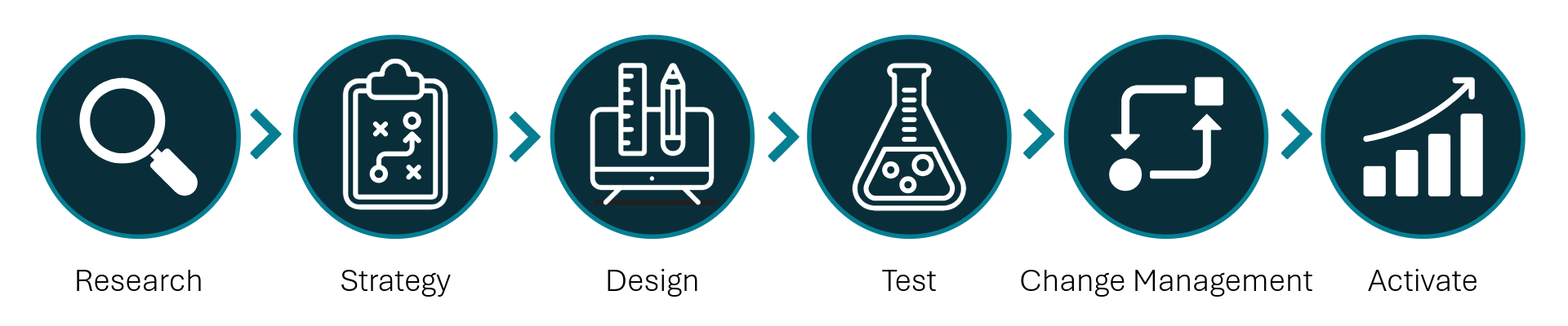
Effective rebrands tend to follow a disciplined progression:
Graphic by Craig George
Research. Understand existing perceptions, audiences, competitors, culture, market conditions, strengths, weaknesses, and distinctive brand assets.
Turn research into strategy. Define where the organization is going, what it should stand for, whom it must reach, and what position it can credibly own.
Build the verbal and visual brand together. Messaging, positioning, identity, typography, imagery, voice, and experience should reinforce the same idea.
Test. Validate strategic concepts and creative execution with the audiences who actually matter.
Prepare the organization. Employees should understand the brand before customers are expected to. Training, tools, templates, governance, and leadership alignment matter.
Activate, measure, and evolve. A launch date is the beginning of a rebrand, not the end of one. Monitor awareness, perceptions, adoption, engagement, consistency, and business performance—and refine accordingly.
And there is a reason the process contains so many steps before anyone celebrates a new logo.
Your brand may need a rebrand. Or it may need something else.
While a hundred-billion dollar company like Instagram can afford thousands of comments debating whether an “r” looks like a “z”, most organizations have more at stake. A poorly conceived rebrand can confuse customers, alienate employees, weaken recognition, waste significant resources, and solve none of the business problems that inspired the project in the first place.
A good rebrand can do the opposite. It can clarify what an organization stands for, unify teams, strengthen relevance, differentiate the business, improve recognition, and create a platform for future growth.
Before deciding that your organization needs a new name, new logo, new website, or complete identity, start with an objective assessment of the brand you already have. Identify the equity worth protecting. Understand what your audiences actually think. Determine where the business is going. Then build the brand needed to get there.
At LMD Agency, we approach branding as architects, not decorators. Research informs strategy. Strategy informs creative. Testing validates decisions. And activation helps turn a brand from an identity into an experience.
The goal of a rebrand isn’t to make people say, “Nice logo.” It’s to make your organization clearer, stronger, more relevant, and better prepared for what comes next.
Considering a rebrand for your organization? Let’s talk.