LMD’s 50th Anniversary—Our History Told Through Brand Identity
To celebrate LMD’s 50-year milestone, we took some time to reflect on how our brand identity has evolved to reflect our growth, innovation, and expanding capabilities.
Over the past five decades, we’ve undergone four major brand identity evolutions, each reflecting the design trends of the day and LMD’s mission and offerings at that time.
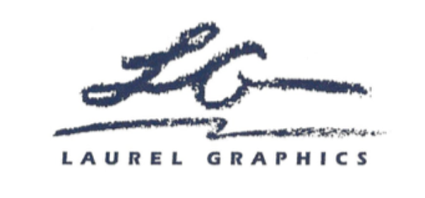
Our 1980 logo was handwritten by our founder and former owner, Sarah Pugh—a tribute to the thoughtful hand touches Laurel Graphics put on every project.
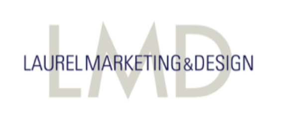
In 1995, we became Laurel Marketing & Design to accommodate our rapidly growing service offerings and adopted a bold, clean logo to fit the world of emerging technology.
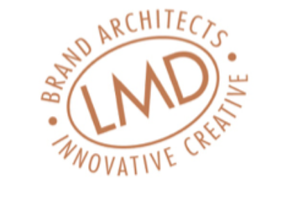
Our 2003 rendition served us well for 15 years and was modeled after a seal of approval that guarantees trusted products and services.
1980
1995
2003
When approaching our major redesign in 2018, our objective was simple—to develop a mark that was creative, flexible, scalable, adaptive, and, most importantly, aligns with our offerings and brand personality.
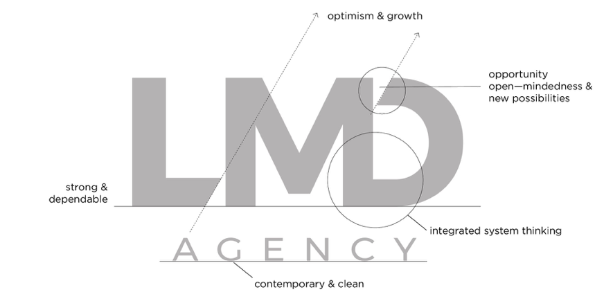
Typography: The font used for the letters “LMD” needed to be strong and solid to embody our history, resilience in the face of adversity, and commitment to our clients and causes. It also needed an innovative edge that aligns with our strategic thinking and creative solutions. In the end, we chose Montserrat as the foundational font because it had all the desired qualities.
Concept: To best capture the spirit of our brand visually, we slightly modified the letters, with the most dramatic modifications reserved for the “bookend” letters, “L” and “D.” The strong diagonals play off the “M,” deliberately leading the eye upward to the right to convey energy, forward movement, optimism, and upward growth. The “D” is joined with “M” to represent our integrated approach to the solutions we develop for our clients. To symbolize open-mindedness, opportunities, and new possibilities, we left a negative space at the top of the “D”.
Color: Color has deep meaning and can evoke strong emotions—and strong personal reactions. We challenged ourselves to keep our color choices simple but purposeful. We landed on a primary color scheme of just two colors, a rich, inky black and a vibrant green. Like type in the morning newspaper, the black represents our humble beginnings as a weekly community publication founded 50 years ago. The green represents our future—health, vitality, opportunity, and growth.
Finally, we reach our newest rendition—an evolution of our latest logo to celebrate our 50 years in business and the history of our agency.
LMD is an agency of multitalented, seasoned professionals, all dedicated to bringing about positive change. Inspired by our people and our passion, our brand identity has adapted over the years to reflect our creativity and culture.
Like LMD’s brand identity, every logo has a story. But consider this: At the end of the day, it’s the interpretation and impression your logo leaves on your audience that really matters. It’s with this knowledge and 50 years of experience that LMD captures and communicates the essence of our clients’ brands to their audiences.
That’s our story. How can we help you tell yours?