Did you know the human eye is trained to see motion over stillness? Glance around the room—you’ll probably find that your eyes are drawn to the flicker of your lights or the spinning of your ceiling fan.
Maybe this is why logo animation is on an upward trend. Brands want their logos to make a strong impression, and nothing catches the eye like motion. But like the design of the logo itself, how your logo moves tells your audience about your brand’s values and offerings. Animating your logo should be done thoughtfully.
Like how we view shapes, we tie emotion to movements through connotations. A bubble gently blowing in the wind is playful, while a bowling ball crashing on the floor is aggressive. Understanding these connections helps you animate your logo to evoke the right emotions in your audience, and avoid animation mistakes. Here are a few do’s and dont’s of animating your logo.
Do consider your brand's “vibe.”
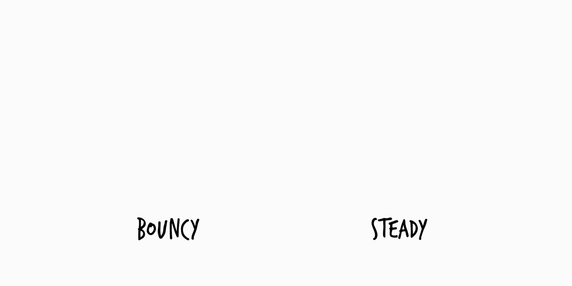
At first glance, these logos may seem to have the same animation–but the bounce back of the first is a bit more playful and childlike. The steady entrance of the other says consistency and stability. Both are good—but convey different emotions. Your brand’s personality should show through in your animation.
Tip: Think about movements that occur in nature, and how they make you feel. Bouncing, twinkling, and wiggling motions are lively, whereas a wave crashing or sunrise are more contemplative. Also think about more literal animations to convey your brand value like growth, upward movement, transformation, and more.
Don’t over (or under) animate.
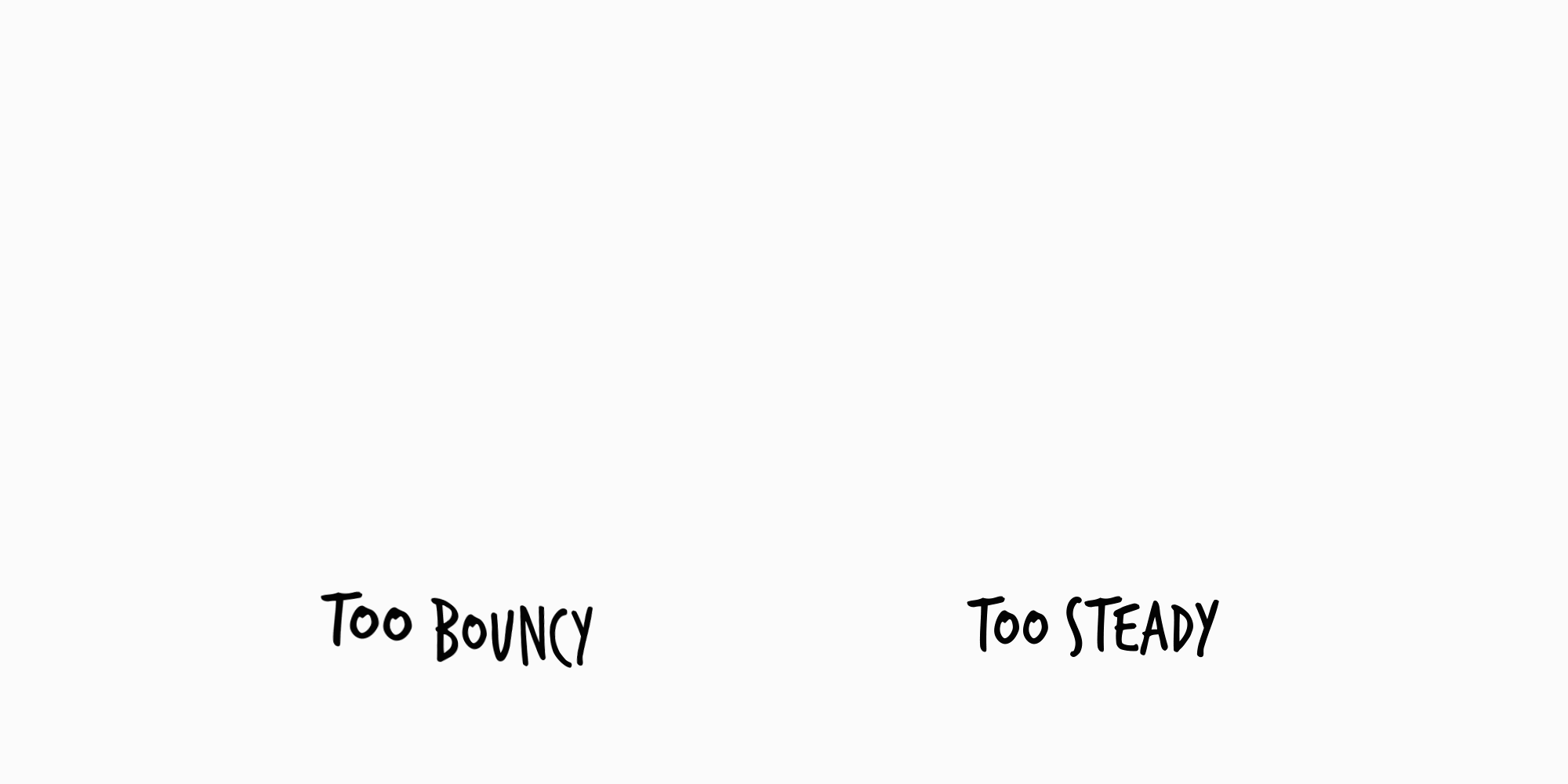
Logo animation should be in service of the brand mark—not overpower it. It’s possible to fall into the trap of over-animating. Don’t sacrifice readability for motion like the first logo. On the flip side, the second is almost unnaturally steady—it reads like a powerpoint transition rather than a fluid movement.
Tip: Explore other brand animations to get a feel for timing, speed, and movement. Once you have animated a few options, show them to fresh eyes (ideally, people both inside and outside your organization) and get honest feedback.
Do think about the context.
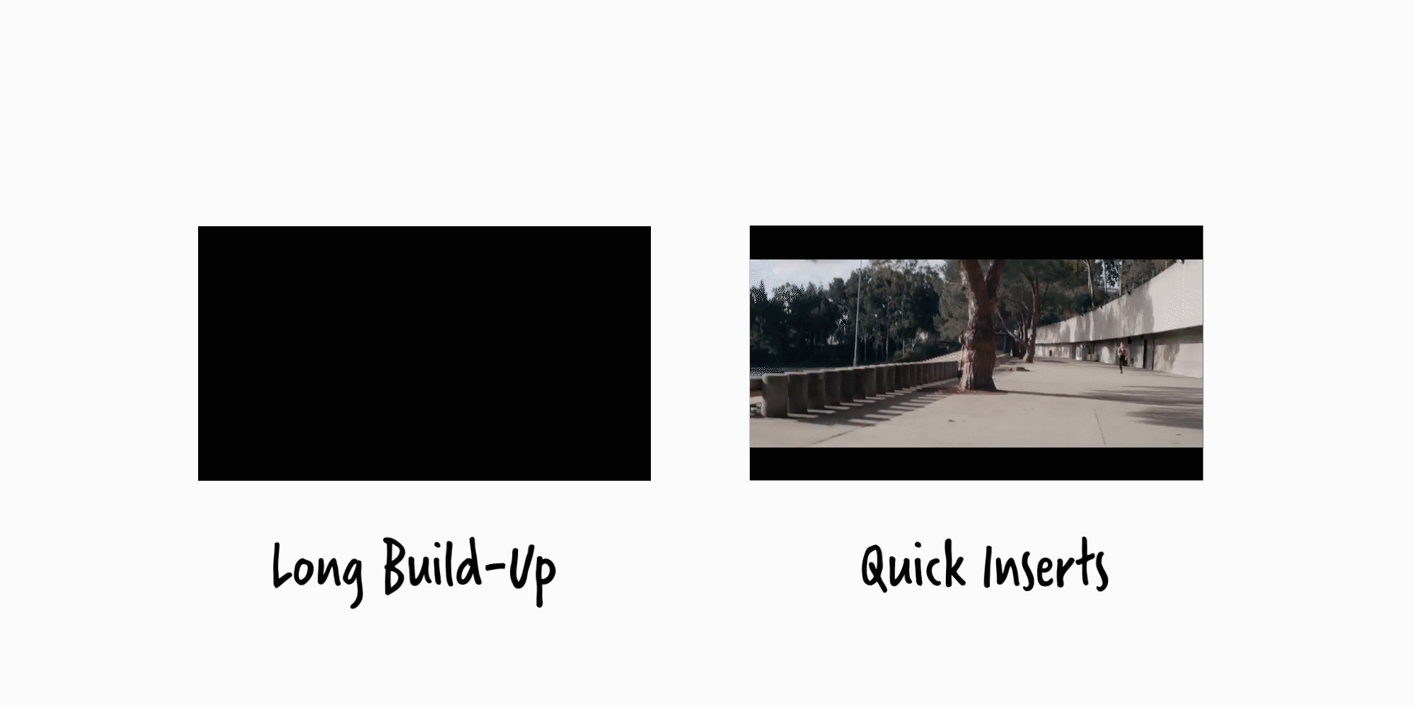
Where is your animated logo likely to appear? For MGM, it’s before a movie trailer or feature film. The MGM logo animation is as iconic as the logo itself because it understands this context. The logo’s dramatic slide-in, rays of light, and classic lion’s roar build suspense and images of grandeur and old Hollywood films. The animation itself is pretty long—a dramatic build-up to a film.
Nike, on the other hand, has a quick flash of logo animation. Nike commercials tend to be quick cuts of athletes, so the flicker of the famous swoosh followed by the equally famous “just do it.” tagline fit the brand style of no-fuss performance wear for athletes.
Tip: Brainstorm where your logo will be used. Is it mainly presentations? Short clips on social media? The end of commercials? This will help you determine how long and complex your animation should be, and if it is building up to something or a final image.
Looking to animate your logo (or create or refresh your logo?) LMD can help.