It’s a common issue in most industries—you’ve collected a ton of data, but the idea of analyzing and presenting it all is overwhelming. Without the luxury of time, resources, and tools, valuable data sits untouched and insights go unrecorded.
That’s where data visualization comes in. Data visualization is the presentation of data in a pictorial, chart, graphical, or visual format. Humans are naturally drawn to visual patterns, so by using charts or graphs to present data, you’ll convey information far more quickly than forcing your user to review large, complex spreadsheets or reports.
With computers in every office, interactive visualization is now an option for nearly every organization. Interactive visualization allows users to view and filter data to a level of detail that is more meaningful to them—thus interactively changing how the data is presented. With programs like Tableau, Excel, Google Charts, users can experiment with different scenarios using filters to find interesting relationships between the data.
Recently LMD has embraced the use of Tableau for data visualization projects. With Tableau, users can connect data from multiple sources, including SQL databases and Excel, and then define additional relationships between the data.
LMD has been using Tableau to analyze recruiting data for a national client and assisting with identifying the trends in their recruiting efforts—for example:
- Where are applications coming from?
- What and who are the primary influencers on the recruits’ decisions?
- What are the socio-economic demographics amongst the recruits?
Answers to these questions helped LMD create an effective marketing campaign targeting the right audience in the right place with resonant, relevant recruitment messages. For example, the following map shows application data grouped by region. Using Tableau, we could also drill down to the state and city level.
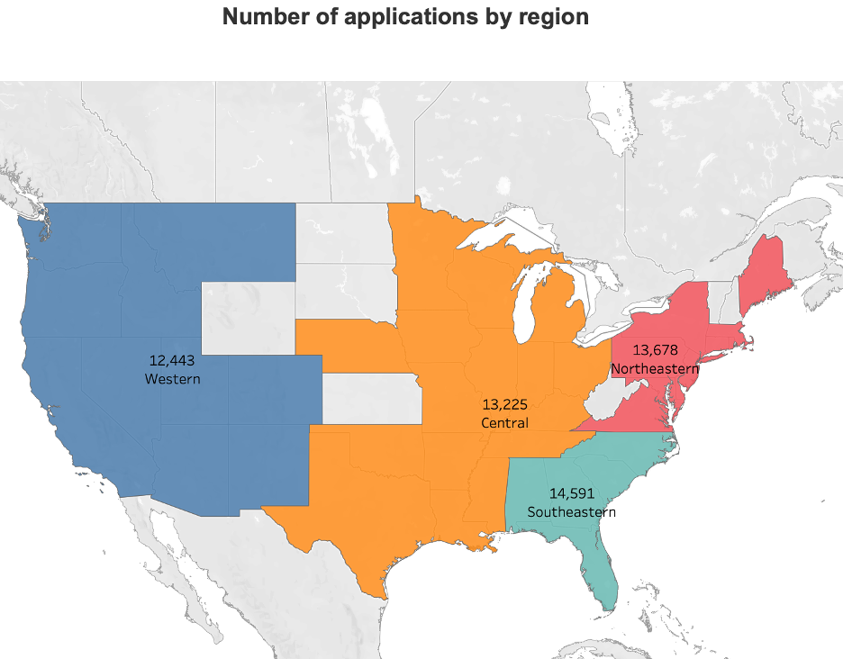
Tableau also helped us analyze over 2 million TV spot placements for the same client. We used Tableau to do some quick state-by-state analysis over time. The data showed us:
- Where to focus our outreach efforts.
- Which spots are most effective, which will guide the production of future spots.
- How we can set more specific targeting goals.
Ultimately, insights from interactive data shaped our campaign strategy—and increased transparency with our client, who could see the impact of their advertising dollars.
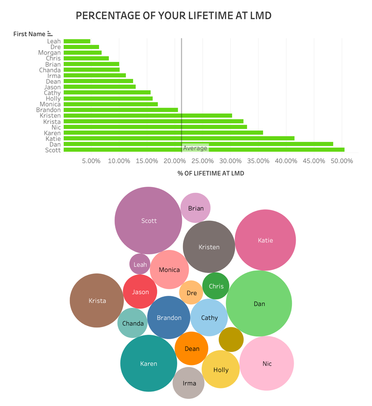
Interactive data is fun too! We recently celebrated the longevity of many of LMD’s employees, and someone said: “It would be fun to see how much of one’s life has been dedicated to LMD.” I quickly connected one of our employee files to Tableau, chose two ways to present the same data, and the following picture emerged:
Data visualization has become a fast-changing blend of both science and creativity. It allows us to communicate ideas and concepts and will be a transformative tool in the corporate landscape over the next few years.
LMD is at the forefront of this data visualization experience, and we can help you better understand and present your data within your organization and to your customers. Let’s get started.