The clock strikes midnight and 2019 is upon us. We write up our resolutions and think about our goals for the year ahead. It's a fresh start and an opportunity to grow – to change.
LMD strives to be a change agency. As design trends evolve, we must too. Some are bound to “teach us love, some teach us patience, and others teach us pain” (as Ariana Grande observed), but the key is adapting – being resilient.
Some design trends we’re monitoring in 2019 include:
- 3D & Disruptive Typography are Taking Letters to a Whole New Dimension Three dimensional typefaces make words pop and bring letters to life. They serve as an immediate eye catcher. The best part? 3D doesn’t discriminate—bold or thin, sans-serif or serif, 3D provides a ton of flexibility for the designer. Similarly, disruptive typography adds a mysterious and somewhat chilling flair to any design—for example, the title treatment of the popular Netflix original series, “You”. (I’m on episode 4, by the way).
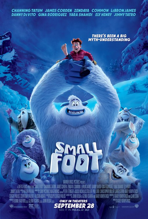
Small Foot Movie Poster (2018)
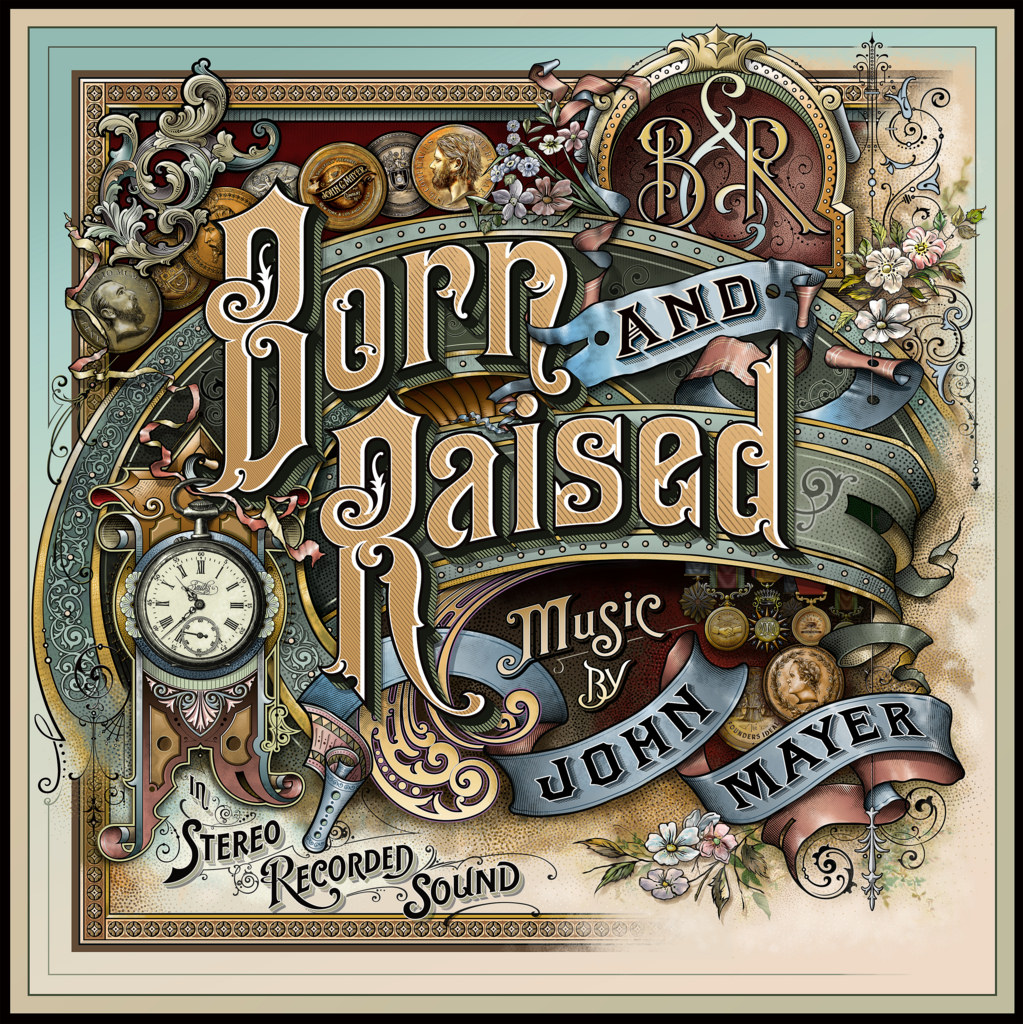
John Mayer's Born and Raised (2012)
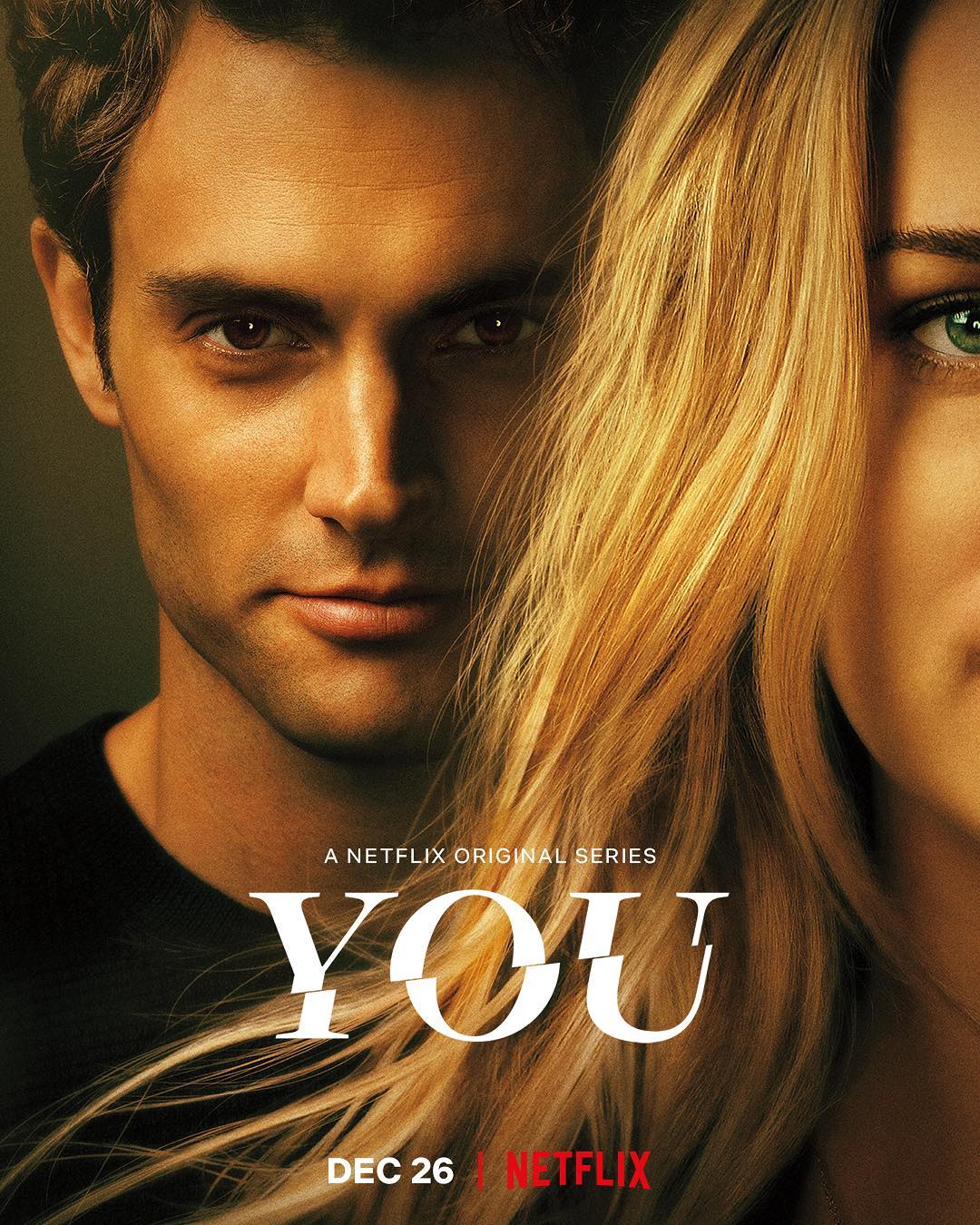
You title treatment (2018)
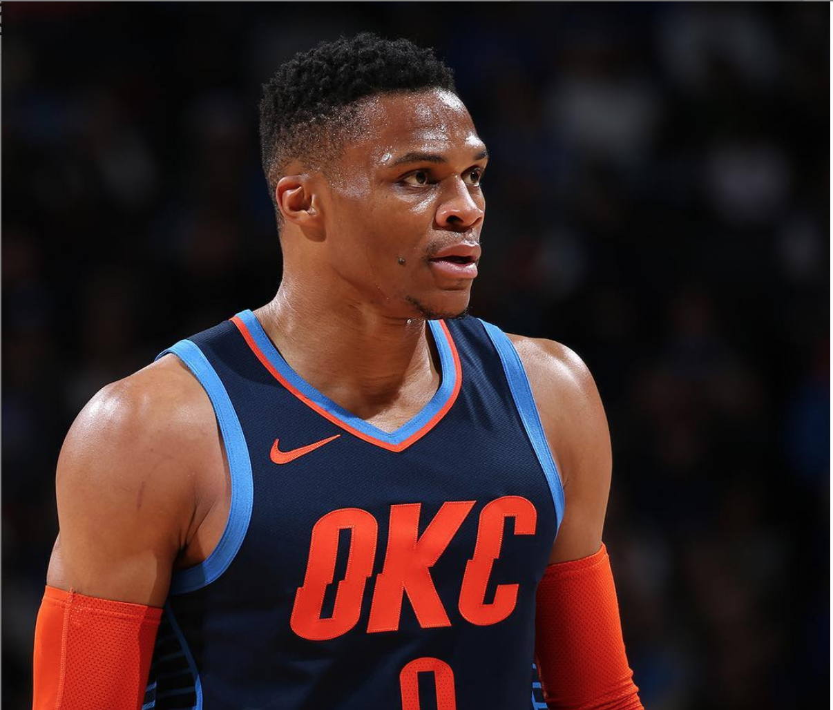
Oklahoma City Thunder's "Statement Edition" jerseys
- Art Deco is Not Going Anywhere Art deco seems to never go out of style (no complaints here). It combines a classic old-school look with a modern feel. We spotted it in on the promotional poster of the most recent cinematic retelling of the “The Great Gatsby” as well as album covers (for example, Florence + the Machine), stamps, and posters across the globe.
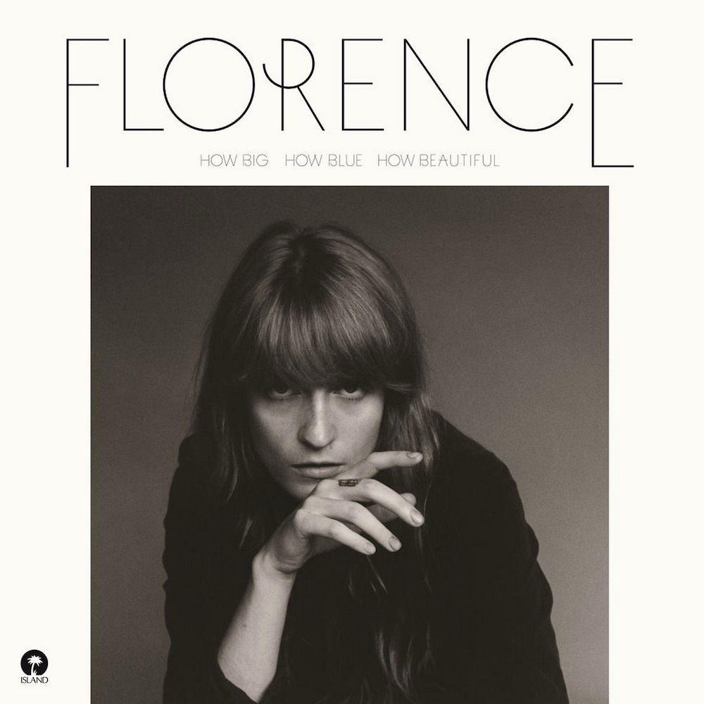
Florence and the Machine's How Big, How Blue, How Beautiful (2015)
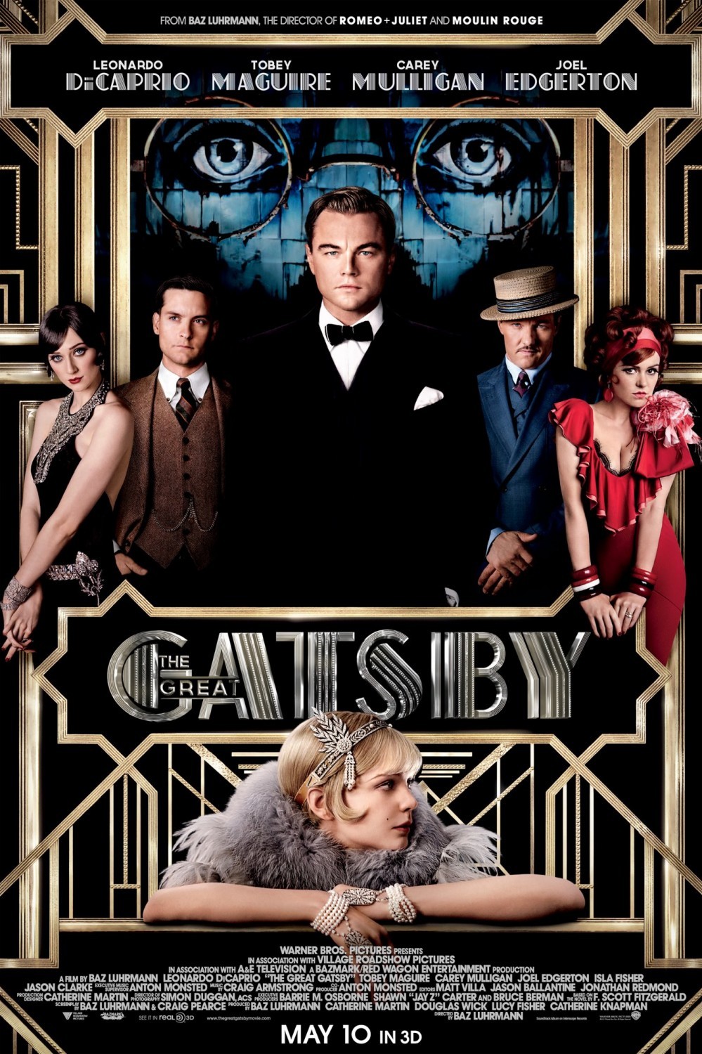
The Great Gatsby (2013)
- Asymmetrical Layouts are Becoming the Norm The grid layout that was force-fed to you for years is becoming a thing of the past. We’re seeing a shift toward showing more movement in design in order to keep the consumer interested. Design template websites such as Squarespace and have caught on, as they have started offering more templates that go against the “grid” and favor a more asymmetrical look.
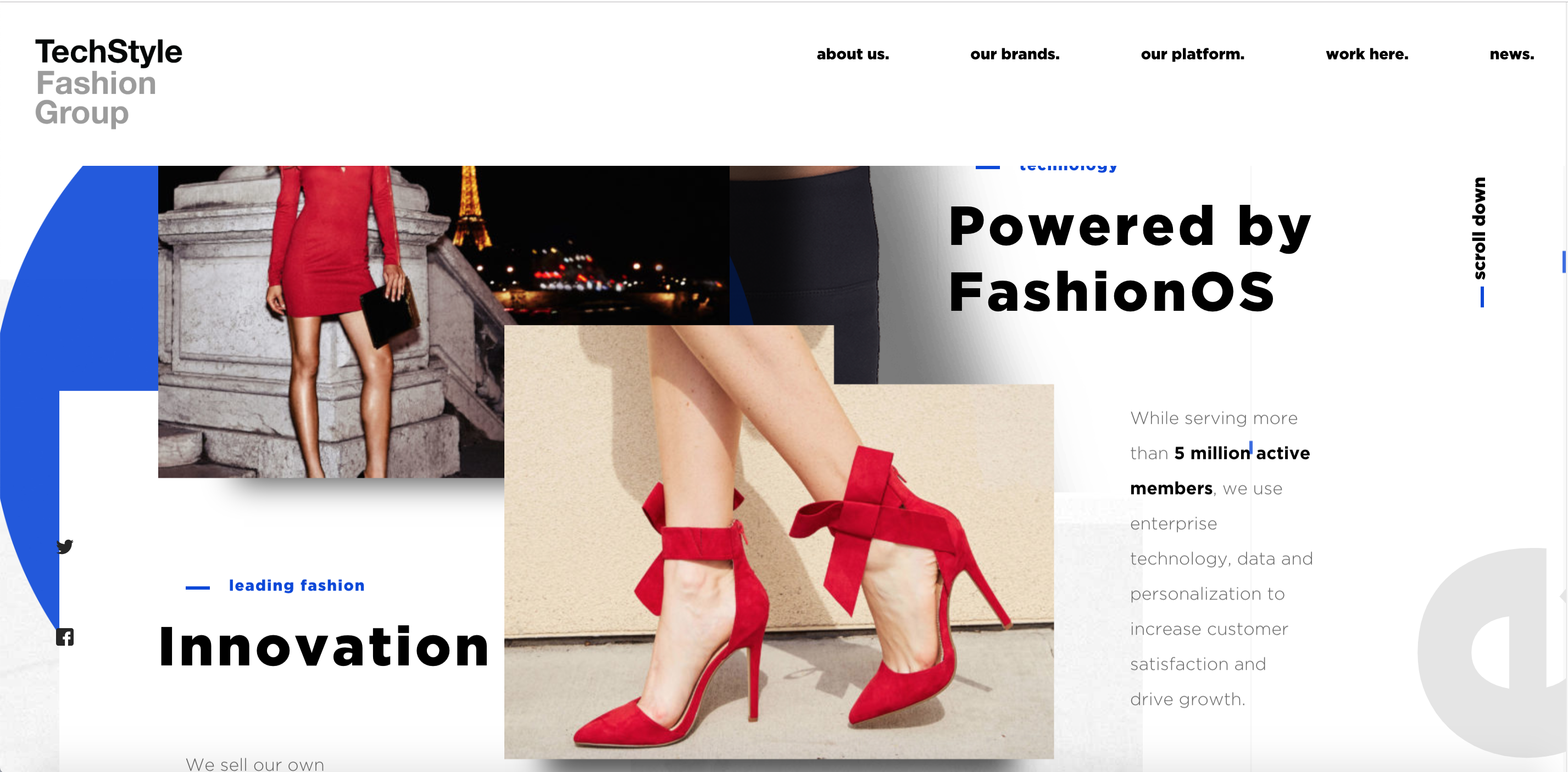
TechStyle's website
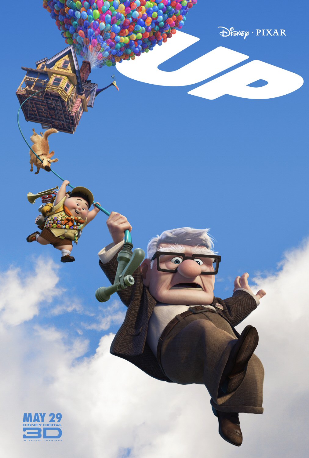
Up (2009)
- Gradients are Here to Stay Whether it’s logos or simply a background feature, gradients are still popular. Instagram, for example, places a colorful, bright gradient behind its white outlined logo. Why? To grab your attention. Asana, a tasking app, does this as well, to a lesser extent.
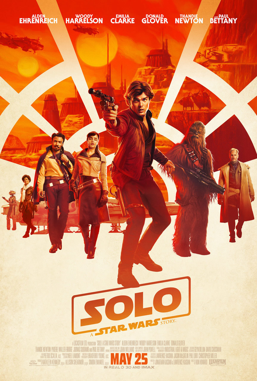
Solo: A Star Wars Story (2018)
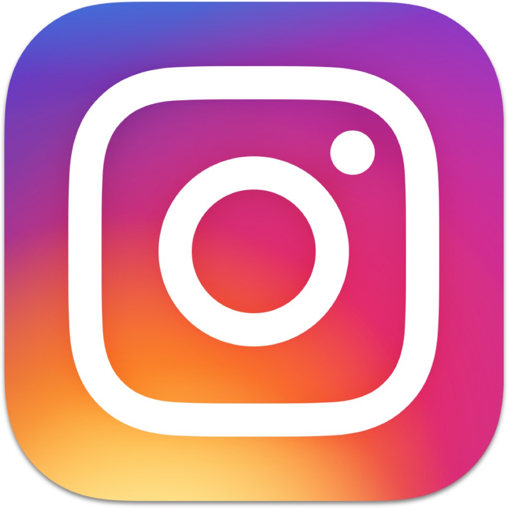
Instagram app icon
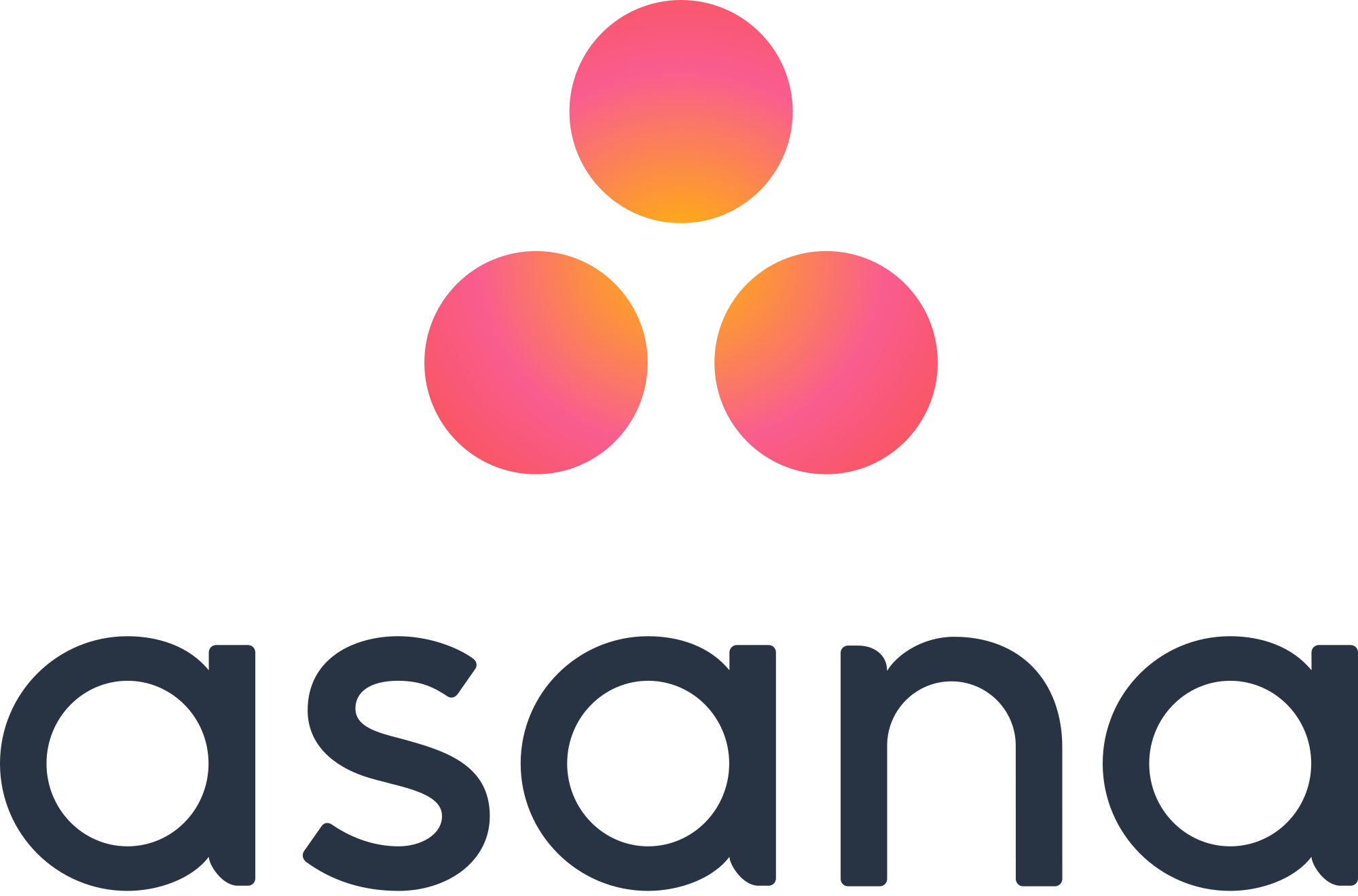
Tasking app Asana
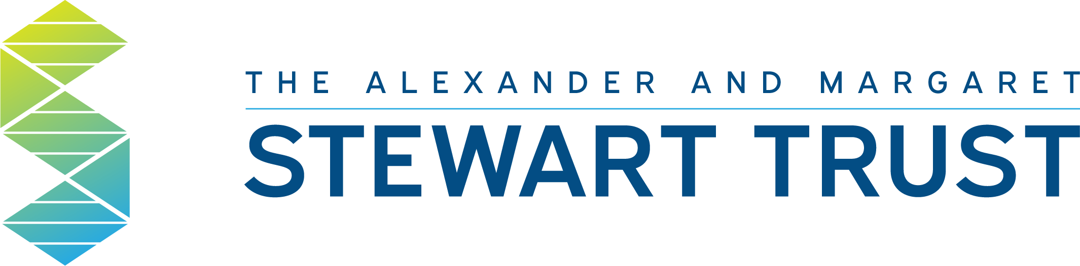
Alexander and Margaret Stewart Trust designed by LMD
- Less Saturated and More Muted Photography is Back in Style Remember the days of finding just the right filter and then turning the saturation all the way up? Forget all that. 2019 brings very muted and neutral-looking imagery, almost as if each image is a still from a video. Even though technology has advanced to take the best photos and capture the most incredible detail, but instead, the trend is lighter, less saturated photos.
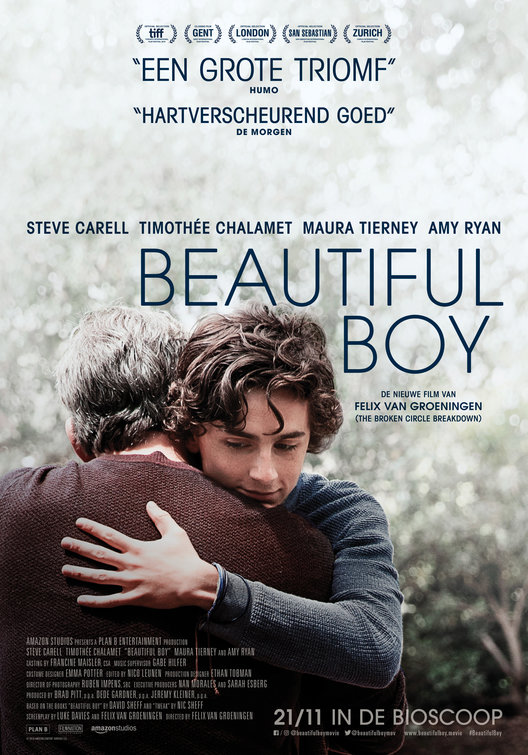
Beautiful Boy (2018)
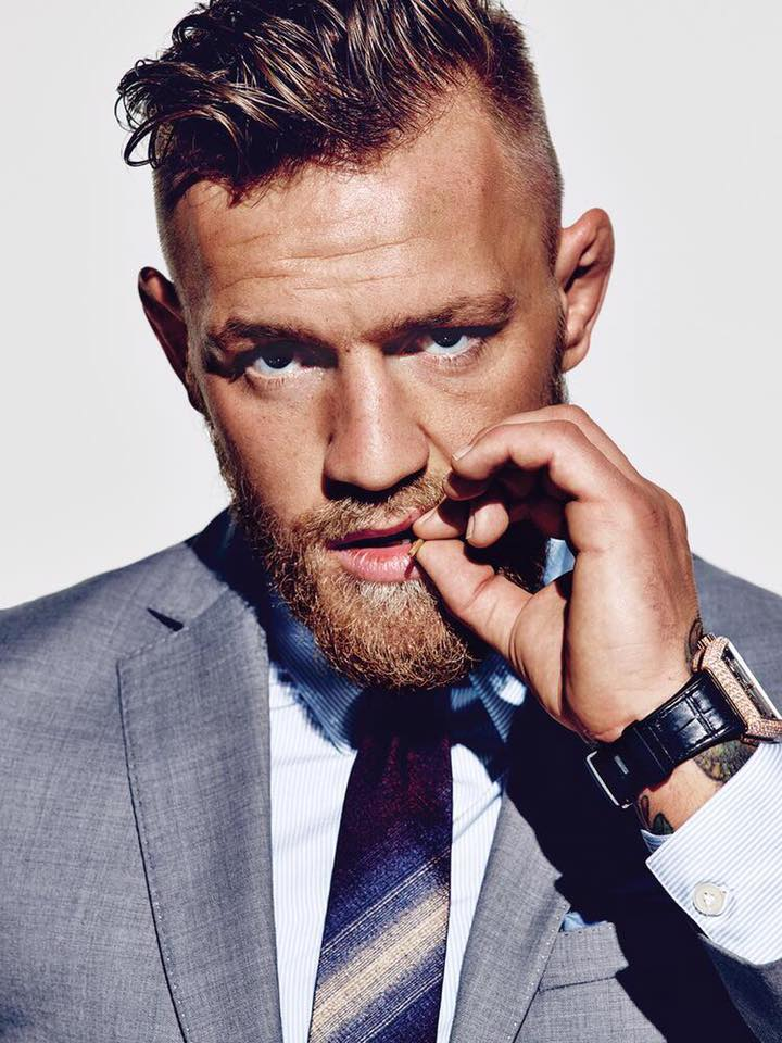
Portrait of Connor McGregor
- Hand Drawn Illustrations and Typefaces Detailed illustrations have been seen on many products recently. These hand-drawn masterpieces add character and elegance to marketing materials. We’ve also seen a rise in the popularity of handwritten type treatments. Whether it be on a product’s packaging or your favorite sports team’s social media, handwritten typefaces are everywhere.
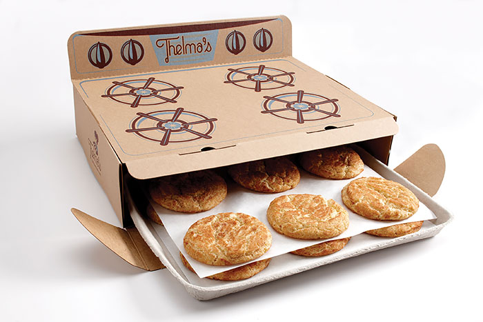
Thelma's Cookies Package Design
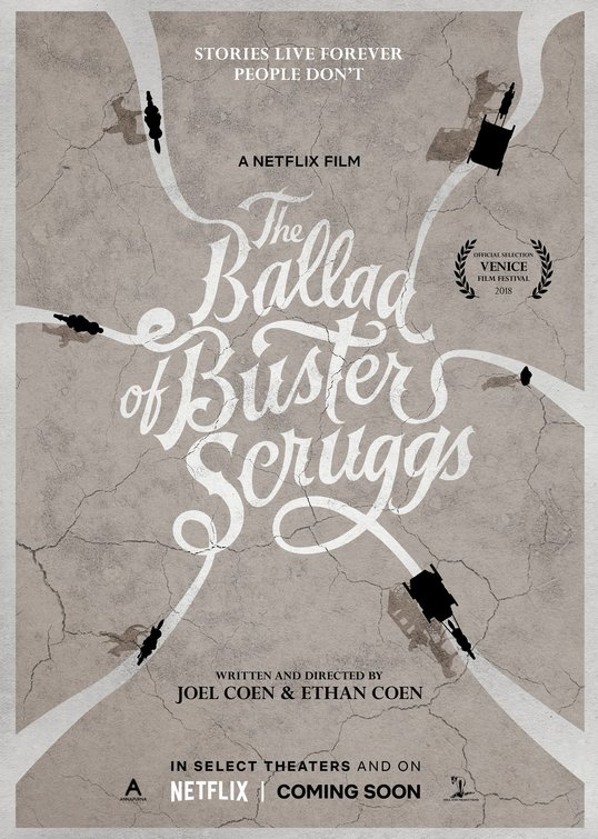
Ballad of Buster Scruggs (2018)
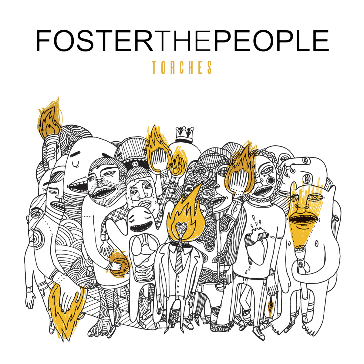
Foster the People's Torches (2011)
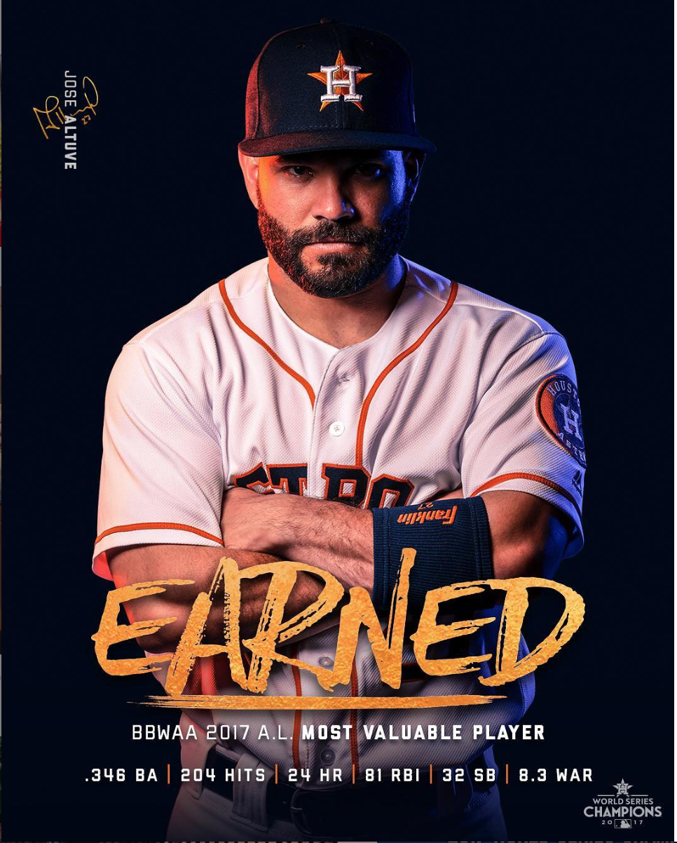
Houston Astros' Instagram graphic
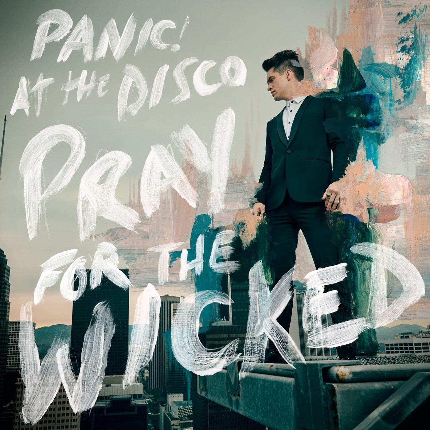
Panic! at the Disco's Pray for the Wicked (2018)
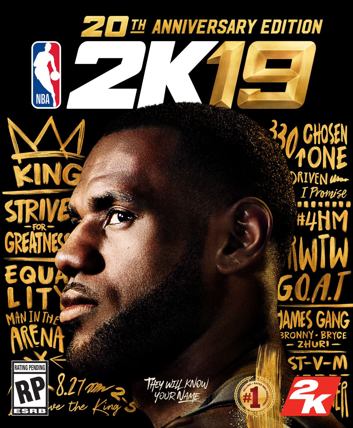
NBA 2K19 (2018/19)
Bring on the New Year—and these new design trends!
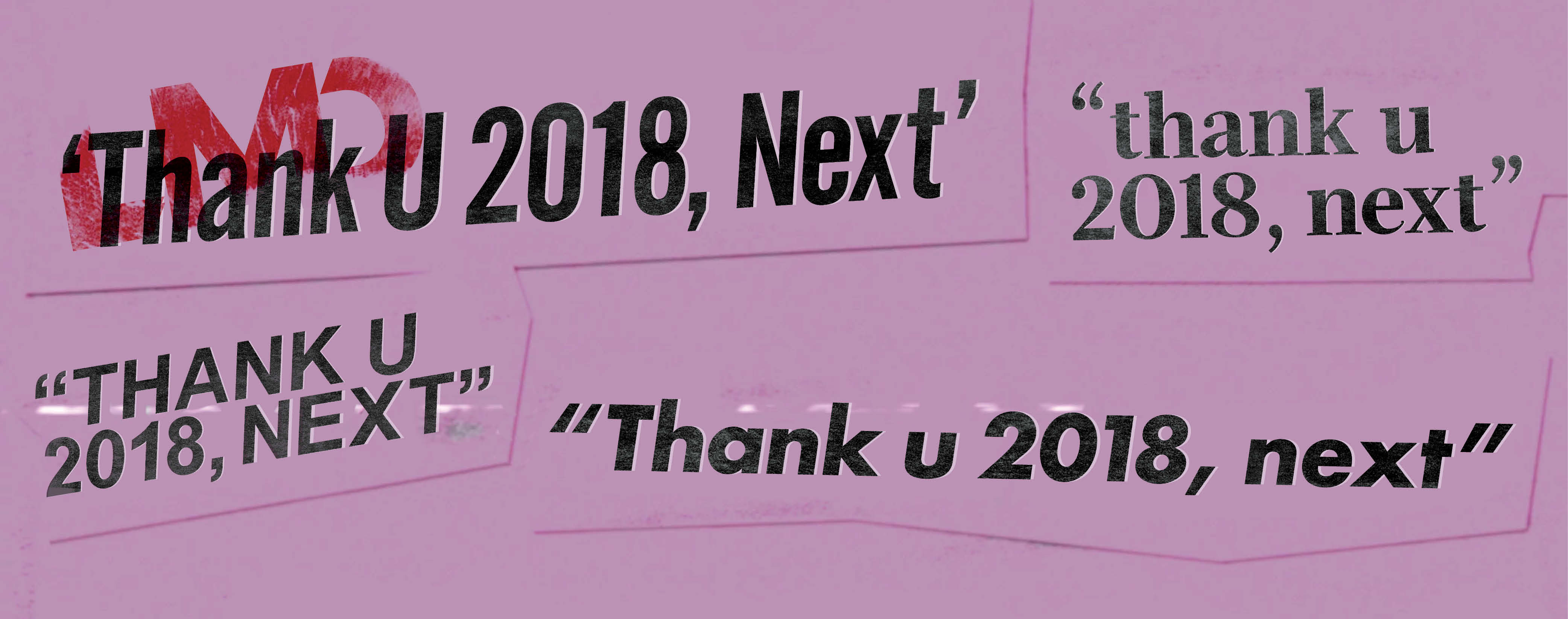
Thank u 2018, next (year).