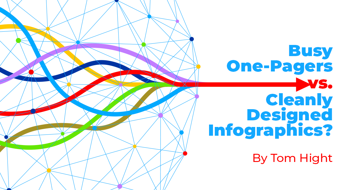
Have you ever seen an infographic with far too much information packed in to be readable or useable? When it comes to creating content for your organization, the difference between a busy one-pager, and a cleanly designed infographic is vital.
What is a "Busy One-pager"?
The Urban Dictionary says a one-pager is essentially a written pitch for your company. It's a simple and short document that gives a high-level overview of a product, service, or a business—basically a modern version of a brochure. The definition of the busy one-pager is the same but because it's packed full of content and every bit of white space is filled, it can make the reader's eyes go wonky.
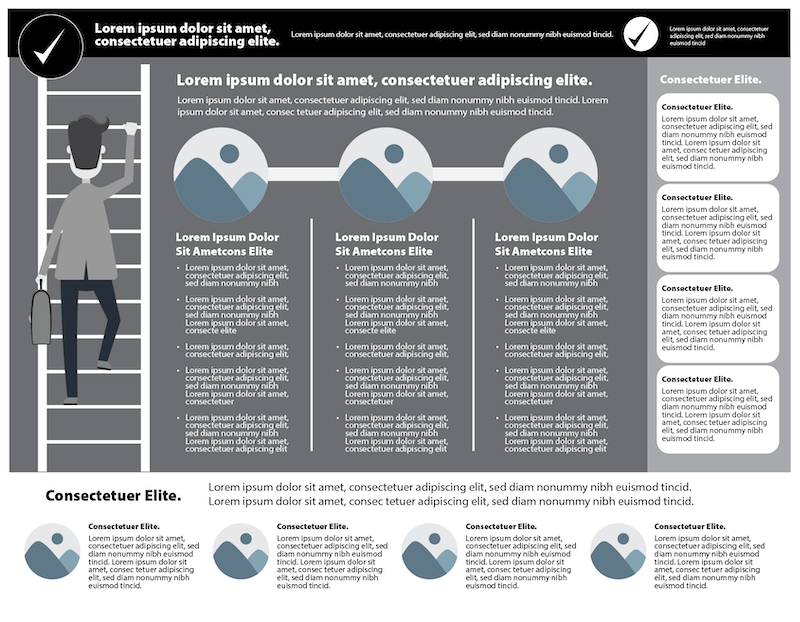
An example of a busy one-pager
A busy one-pager may have some, or all, of these characteristics:
- Super busy layout
- Too much content
- Jammed-together graphics
- Every available space filled
What is a "Cleanly Designed Infographic"?
The English Dictionary says it's a visual image such as a chart or diagram used to represent information or data. A cleanly designed infographic takes all that content, simplifies the messages, and gives the appropriate graphics some white space. It needs to be quickly read and visually understood.
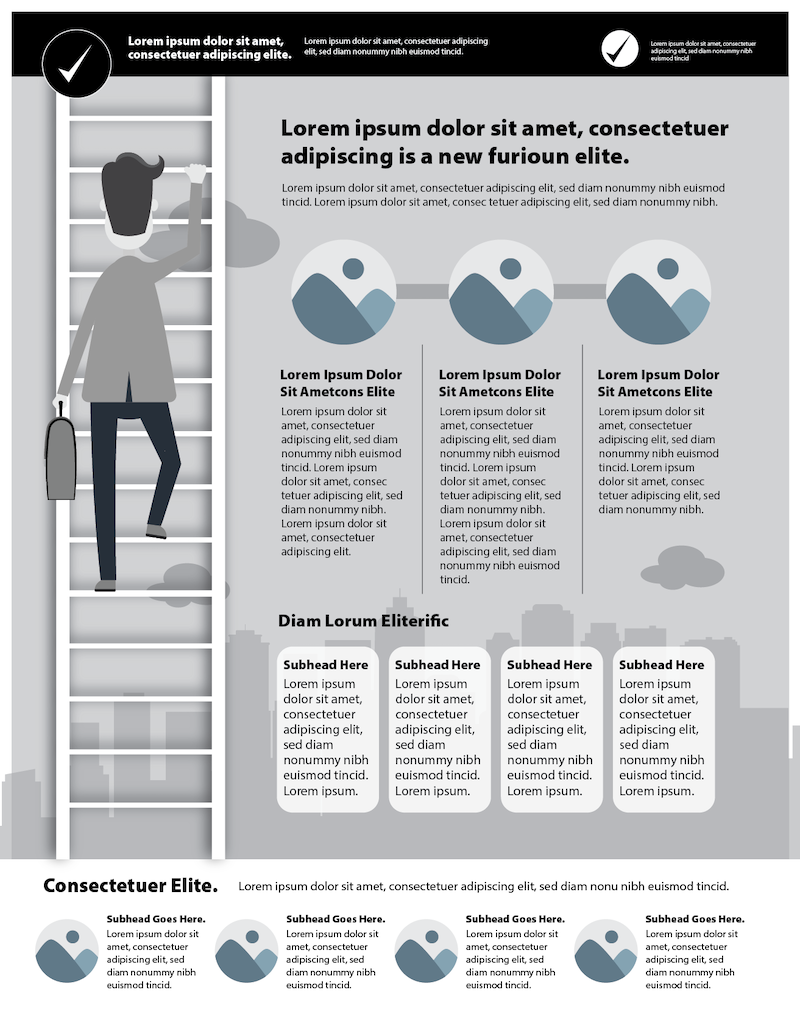
An example of a cleanly designed infographic
A cleanly designed infographic:
- Has a clean layout
- Is easy to read
- Has appropriately placed graphics
- Has plenty of open space
We understand the importance of taking a complex topic and turning it into a stunning infographic. When it's time to create your organizations' content, remember to keep it clean and straightforward to communicate your message across in a creative and visually dynamic way. Or, just call LMD.