It’s 2021. Collecting vinyl is as “in” as ever and your favorite show from years past just announced a reboot—but you’ve also grown tired of seeing every romantic comedy follow the same formula. Likewise, your company’s brand is tired and is in dire need of a refresh to better position your business for lasting success. Do you follow the trend of going back to your roots by recycling your brand, or decide to rebrand yourself entirely?
Recycle
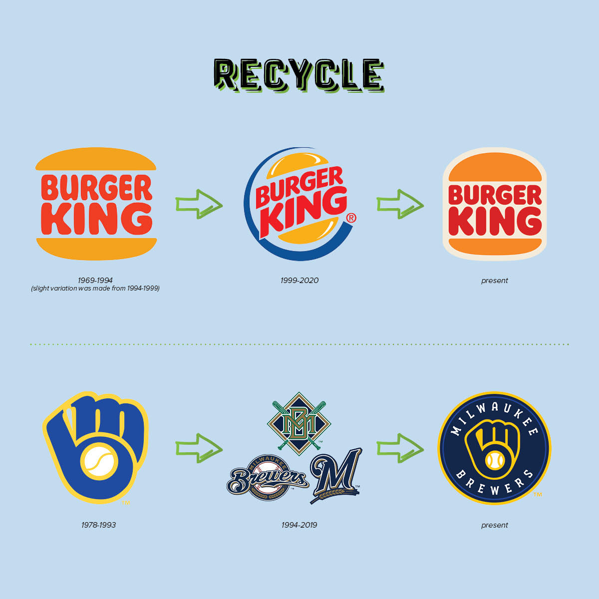
We’ve seen a recent design trend with businesses revisiting and modernizing their old marks. For example, last season, the Milwaukee Brewers returned to their classic “MB” within a baseball glove logo (we’re not complaining) and revamped their jerseys and color scheme as well.
Burger King also rang in the new year by recycling the logo that represented them from 1969-1994. They ditched the shiny bun encircled by a royal blue semi-circle logo after twenty years and introduced some nostalgic elements. As fast-food chains continue to make a push toward fancier and more spacious interiors, it’s not surprising that Burger King wanted to shift their brand to a more classic look and feel.
But what does it all mean? Why go back to your “ex”? Why “recycle” an old brand instead of starting fresh? There are a couple of different reasons:
- You made a very expensive mistake when you decided to make a change in the first place.
- You thought you had to “keep up with the times” and in doing so, did the exact opposite.
The takeaway: If it ain’t broke, don’t fix it. A classic logo will always be a classic logo. Choose an enduring logo that embodies your brand, rather than following a fad.
Rebrand
On the other hand, a company might choose to completely rebrand themselves. For example, General Motors is no longer represented by the capital letters of “GM.” The company now uses a lowercase “gm” with the negative space of the “m” suggesting an electrical plug (plugs aren’t completely universal and GM being such a massive conglomerate, so it’s a little surprising that this symbolism was overlooked). The rounded edges of the square, the gradient blue tones, and the lowercase font do lend a modern look and welcoming feel. The line underneath the lowercase “m” also draws a parallel to the line underneath the previous GM logo.
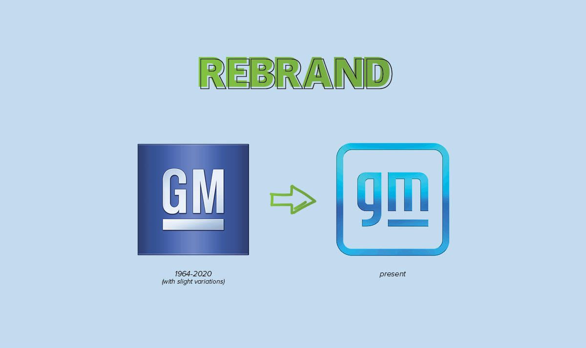
Will the new and modernized look resonate with consumers? The logo is so new that response remains to be seen but we will be watching in the coming months for how the market reacts to the new look.
The takeaway: For a company as big and well-known as GM, a logo change may not affect their bottom line too much. But the reaction and receptivity of your customers to changing your brand is definitely something to think about if you decide to rebrand. Some good reasons to go in for a complete rebrand include:
- To update and modernize your brand’s look—and in doing so, attract new markets and customers.
- To better reflect what your company does.
- To differentiate yourself from the competition.
- To look more professional and polished.
Do you or a client you know need help with their brand? Look no further than LMD.